The Oat Milk industry is growing every year, and the most popular brands include- Oatly, Rude Heath, Minor Figures and Innocent.
Each of these brands have a different ethos, colour scheme and typography set up, but all have one thing in common: they’re trending.
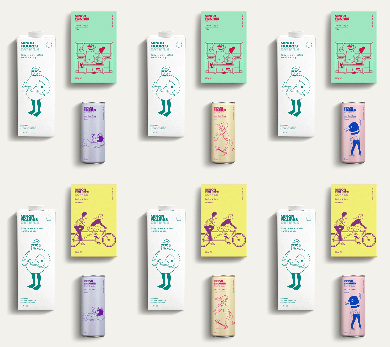
“We make plant-based, 100% vegan products to lift your coffee and your mind – be that in the comfort of your home or in your favourite local spot.”- Minor Figures
Minor Figures have two oat milk options- organic and original. Both of these are in plain colours, the original is white with aqua writing and the organic is charcoal with aqua writing also. All of the illustrations are also all in the same aqua blue colour.
The typography stays consistent throughout the entire brand, including in their cold brew cans, filter coffee and apparel.
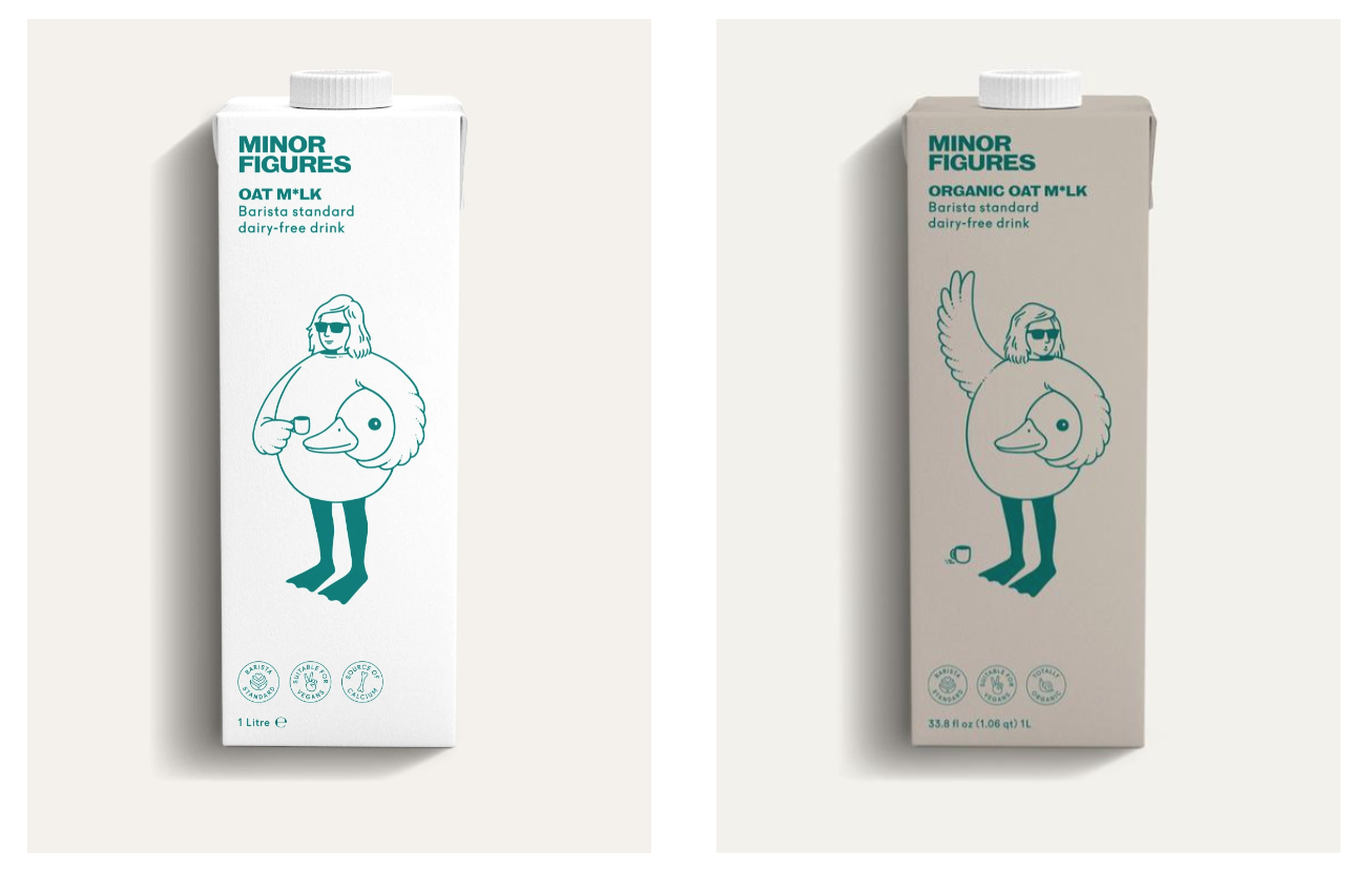
The typography Minor Figures uses is original but very similar to- ‘RW Linear ExtraWide Ultra Bold’ by URW Type Foundry.
The M and N are slightly thinner, and the G has a slight swash at the bottom of it. The i in ‘milk’ has a ‘*’ as a replacement to emphasise that it is a vegan milk brand and therefore not actual ‘cows milk’.

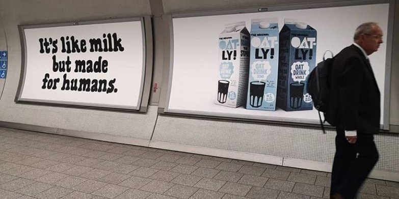
Oatly is similar, with 5 different options with a colour range of blue, baby blue, grey, white, light brown and dark brown. All typography is in a mixture of black, white and blue depending on the range.
“Our sole purpose as a company is to make it easy for people to turn what they eat and drink into personal moments of healthy joy without recklessly taxing the planet’s resources in the process”
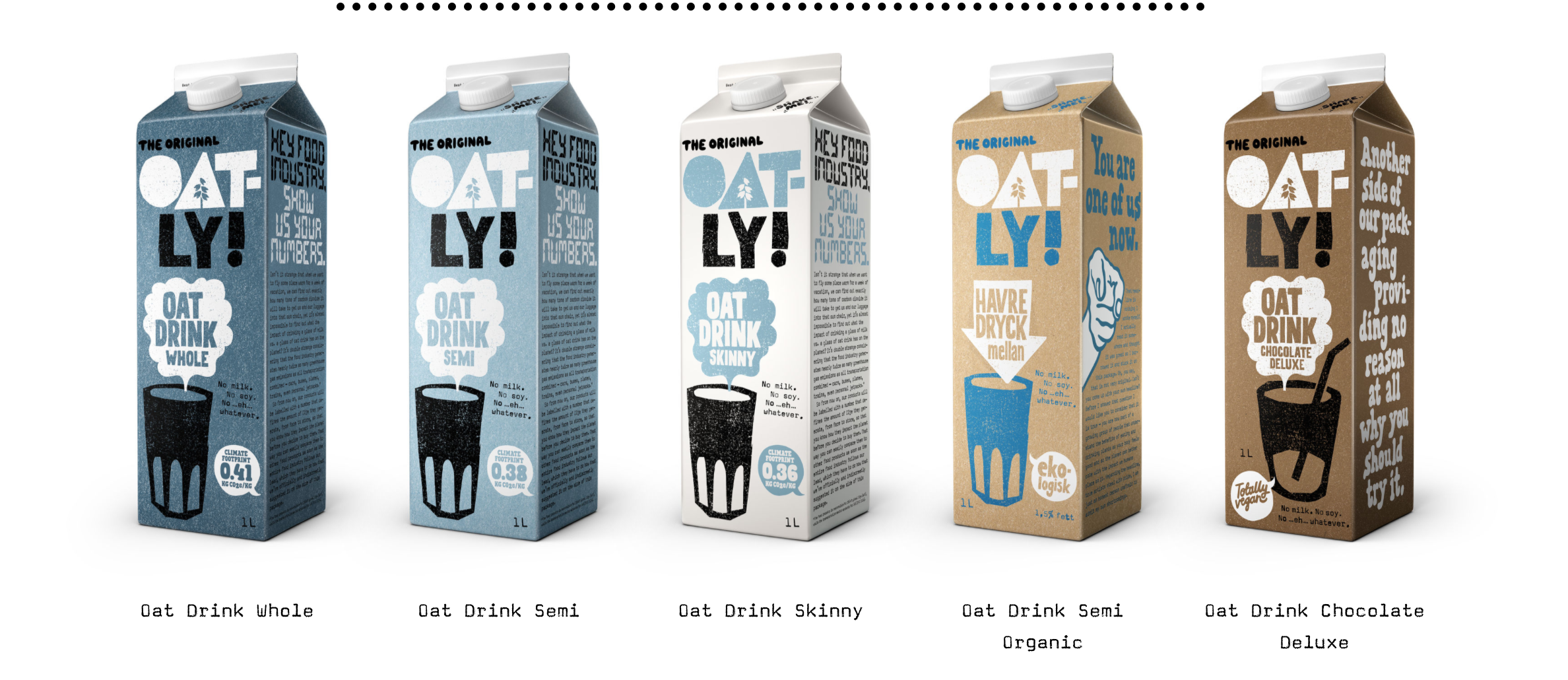
The typography used stays consistent throughout the entire brand, including in their yogurts, cold brews, ice creams and spreads.

The typography OATLY uses is original but very similar to ‘kokoschka print’ by pintassilgo Prints.
The typography is bold with sharp edges, the A in ‘oat’ is a block triangle with a tree cut out of the middle and the colour of the first half is blue and half second half black.
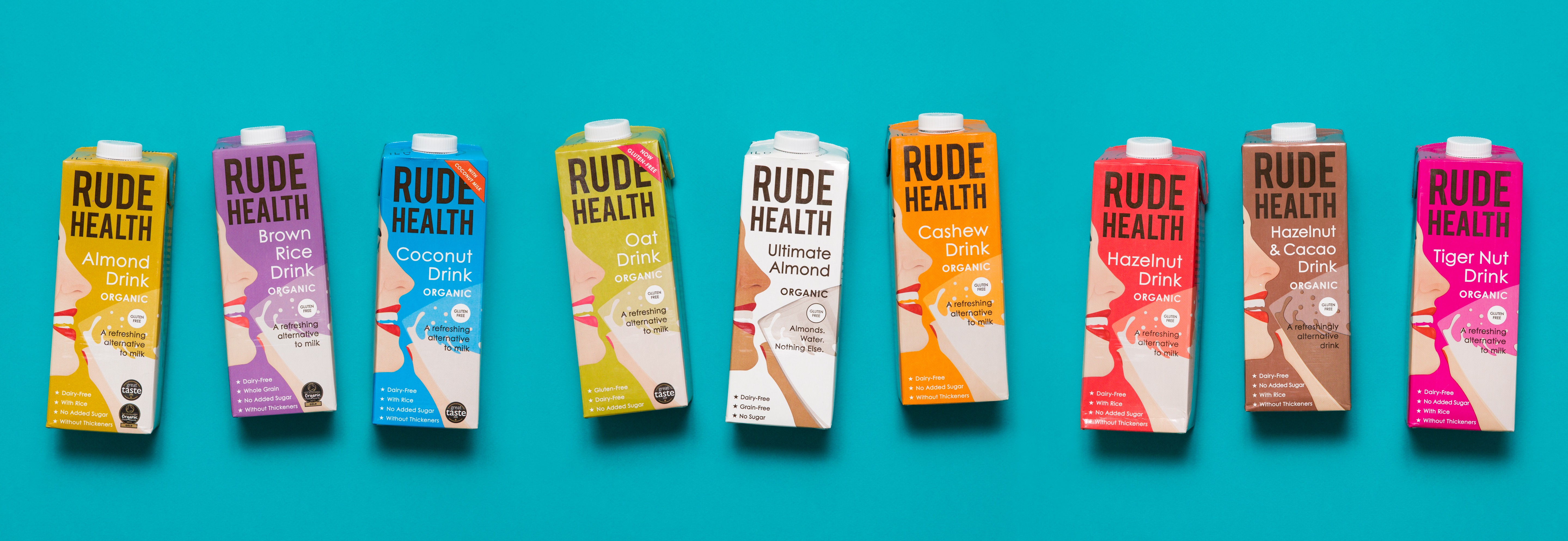
“WE’RE RUDE HEALTH- Brilliant ingredients. Nothing artificial. Nothing refined.”
Rude Health have simple graphics and typography but with a brighter colour range- they have purple, pink, blue, green, brown and white- each type of milk comes in a different colour.
The Oat is bright blue, dark yellow and dark brown.
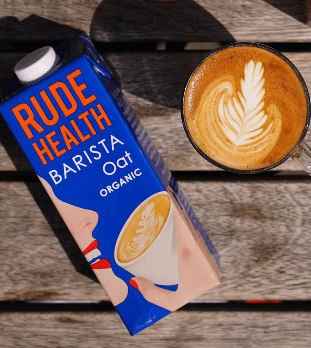
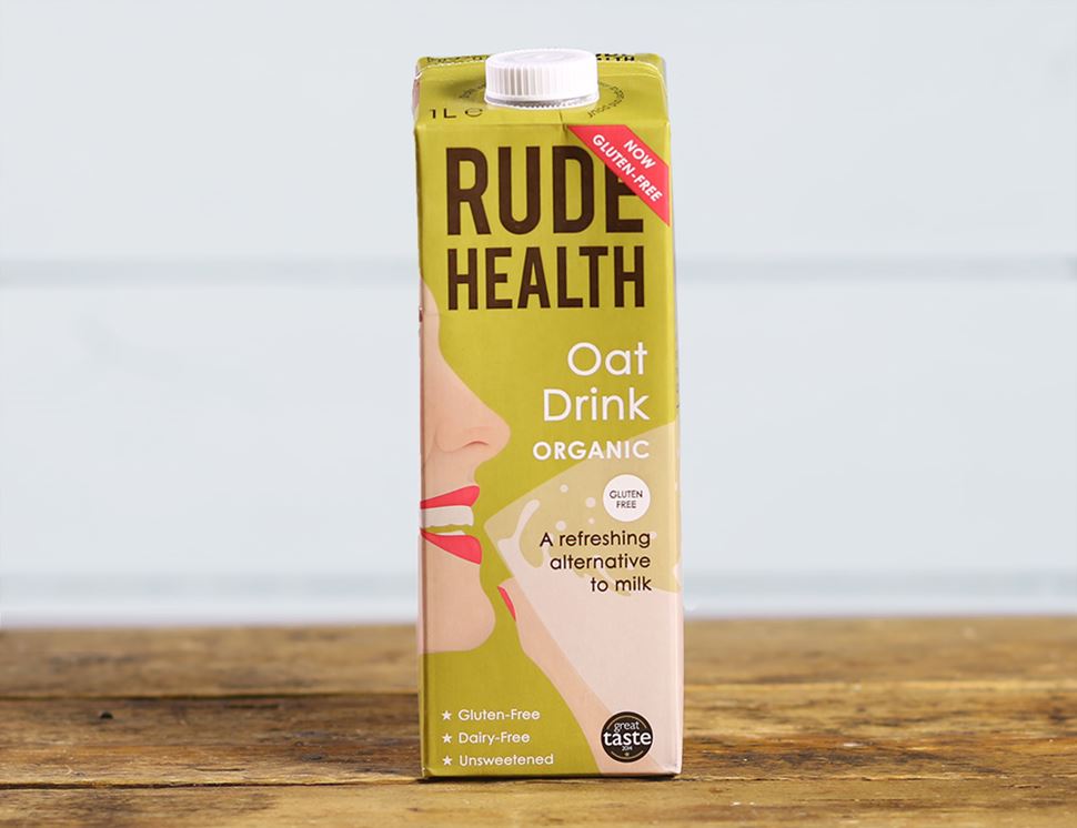
The typography Rude Health use stays consistent through the entire brand, including in their milks, granolas, cereals, and snacks.
The typography they use is ‘Mensrea Regular’ by Typograma. Its bold and large, with the ‘health’ being a few sizes smaller than the ‘rude’- this is done to emphasis the word health and their connection to it.
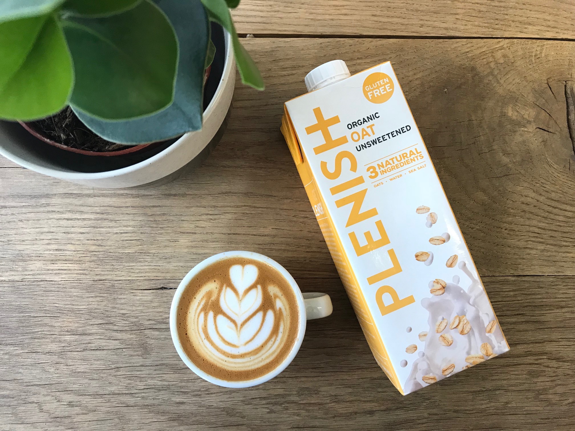
“OUR PURPOSE IS TO INSPIRE EVERY ONE OF US TO MAKE A POSITIVE CHANGE FOR A HEALTHIER WORLD”
“Plenish is an award-winning plant-powered drinks brand that’s on a mission to fuel a healthier world.”
Plenish have one oat milk option and 6 other milk alternative options. Each carton is white with coloured typography depending on the flavour and type of milk. These colours range from- yellow, green, red, purple to blue.
Each of these are in different colours, the original packaging is white with different font colours depending on the milk (soya/ oat/ almond).
The typography stays consistent throughout the entire brand, including in their cold brew cans, filter coffee and apparel.

Each of these Vegan milk brands hold their brand consistency.
Minor Figures is trendy with funky illustrations of girls skateboarding and men in duck costumes smoking, the main oat milk product is white but the cold brew cans come in a variety of pastel colours.
Oatly is more simple and straight to the point, with more neutral white and blue packaging.
Rude Health is all bright colours and black font, they are less trendy but more geared towards health conscious vegans, this is extremely similar to Plenish who are also more of a health conscious brand than a trendy one with the similar colouring to Rude Health but the opposite way around- white packaging with bright multicoloured fonts.
Each of these brands use their own aesthetics to sell products to their customers, there is a place in the market for each of these brands from being instagrammable and cool to being healthy.
